BY BRIAN BYRNE
FROM the outset, the Smart #3 did its damnedest to stop me from liking it. Bad enough is the ridiculous name (‘I drive a Hashtag 3’ doesn’t have the same cachet as ‘Captur’ or ‘Explorer’ or ‘Avenger’. And yes, the # in this case doesn’t have the generally known American English usage for ‘number’. The car IS called a Hashtag).
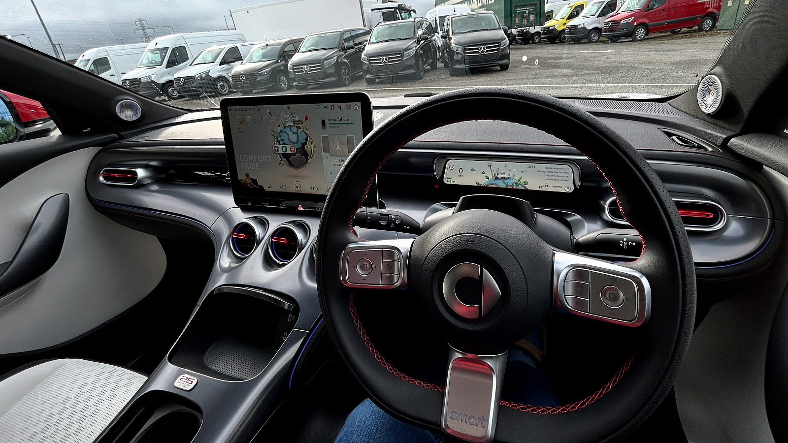
Then there’s the screen. With a big graphic that looks like an exploding planet, maybe Smart is trying to remind us that driving cars is part of why that might be happening. Even if the car is an EV? And an animated leopard moving around in the bottom right of the unit is not just a distraction, but takes up space and electronic jiggery that would be much better used for larger and more easily jabbed virtual buttons.
Then when I had to take it out at night on some rural back roads, the main beam headlights wouldn’t work. Turned out there’s a button beside the steering column that apparently locks off the auto-dimming mode, and also seems to lock out the manual main beam switching. To be honest, after fiddling with it for around 15 minutes, I just gave up. The climate virtual buttons at least were large, and stayed on the bottom of the screen (until I switched to Carplay for navigation, when they were covered and required a couple of menu flips to get back to them). My passenger also got really cheesed off trying to find a happy volume level with the virtual slider.

Smart is owned by Mercedes-Benz and produced in China in a joint venture with Geely. The #3 is the second one I’ve driven and confirmed my reservations about the #1. I’m just surprised that Mercedes-Benz allowed the idiosyncrasies that damage the car’s overall image to get through the development process. This is a car probably made for the Tik Tok generation.
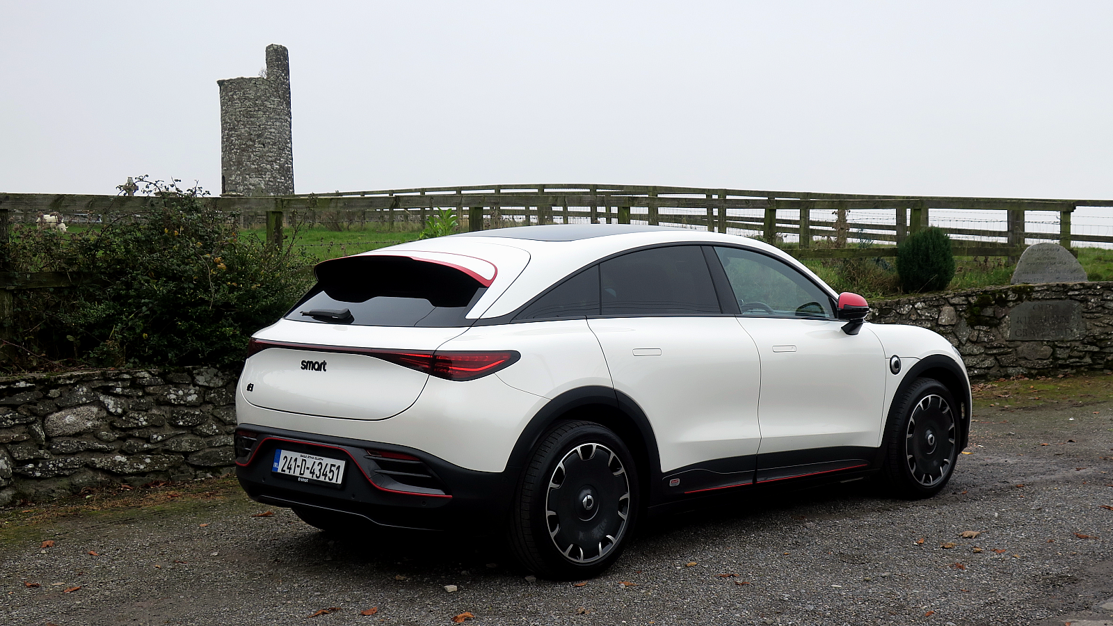
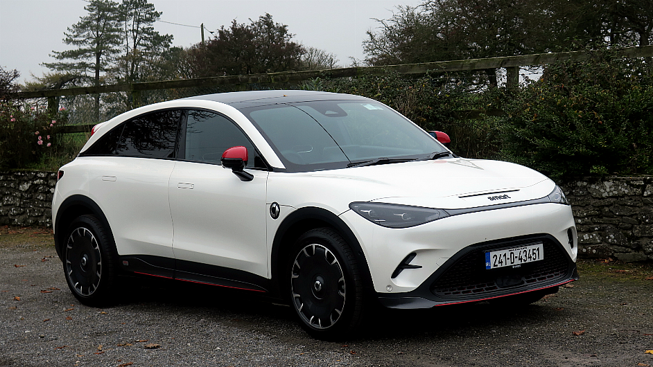
If it had proper knobs and buttons and switches for essential functions, the #3 would be a really fine compact car. It looks individual, with sporty lines that don’t get in the way of good accommodation front and rear. My review car in white with red detailing certainly attracted appreciative attention. And as electric car front-end styling goes, it is really well executed here.

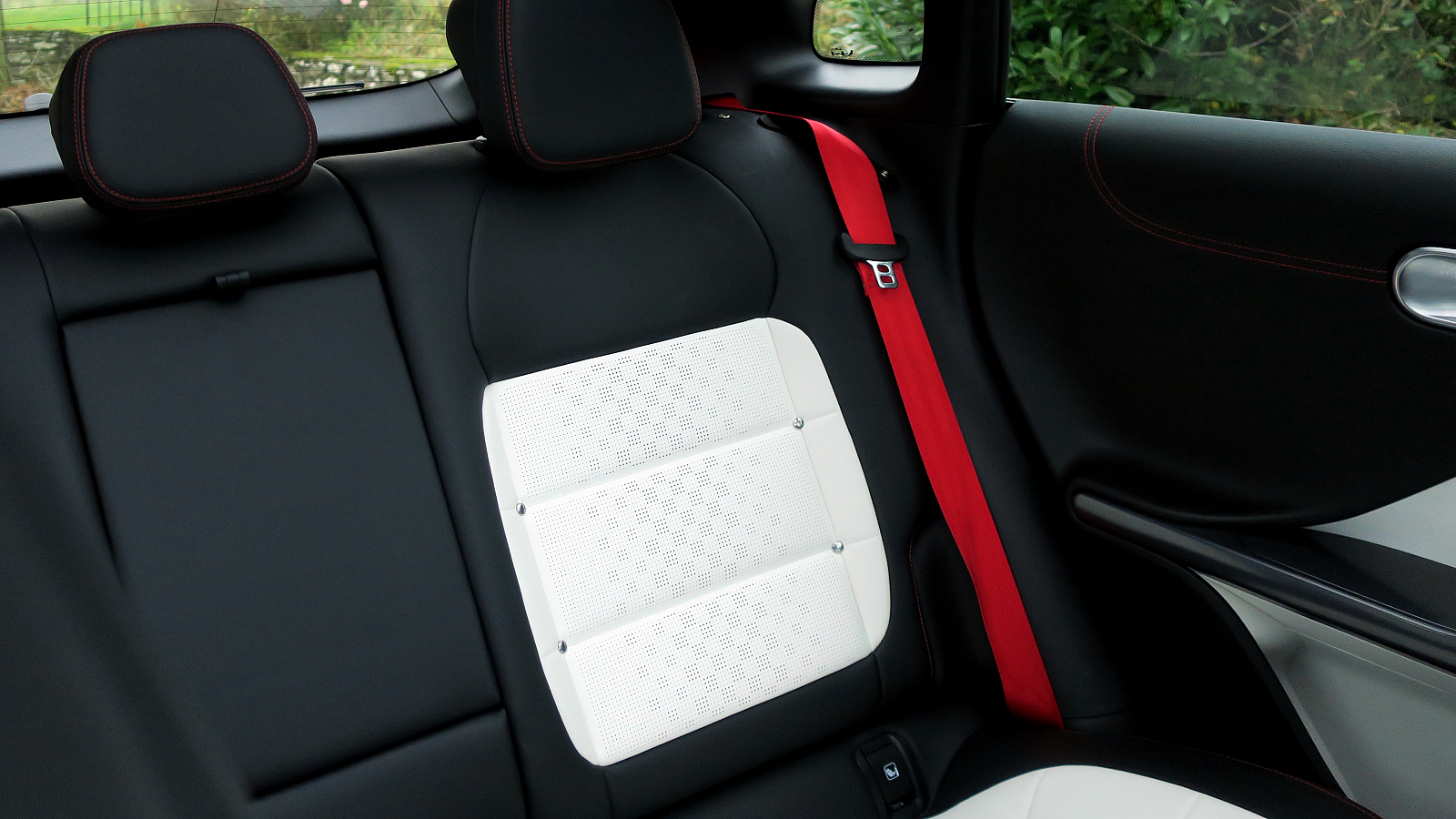
The #3 is decently trimmed inside, apart from the steering wheel buttons’ semi shiny aluminium finish where their finely etched identifiers are invisible in most daytime lighting. The trim and upholstery in the review car had a bit of funkiness related to it being a 25th Anniversary edition, as well as a panoramic glass roof designed to filter out excessive sun heat. I felt the seat support was very good.
The car feels really well built. It also drives like fun, with 272hp offering peppy electric motor acceleration, and there’s relatively nippy handling as far as battery cars and their disproportionate weighting go. A full charge gave me an indicated range of 440km or so, which for most driving needs is plenty. (You know the drill at this stage, take 20% off if you’re doing a long motorway trip at the limit. Stick to 100km/h and you’ll get close to the initial indication.)

All the usual driver assist features. The overspeed warning sounds aren’t too intrusive and you can mentally tune them out. At least there is also a bit of delay between inadvertently topping the limit and getting back to the straight and narrow.
Despite all my foregoing moans, I actually did get to like the #3. A number of attractive features give reasons to at least try for a relationship and see where it goes. But is the car a five-year marriage option? There’s a lot of competition out there in this EV segment, and if I was into Tik Tok and Tinder, I might still be swiping.


